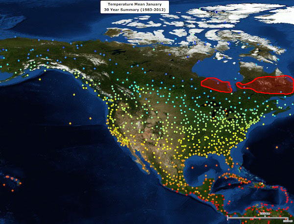
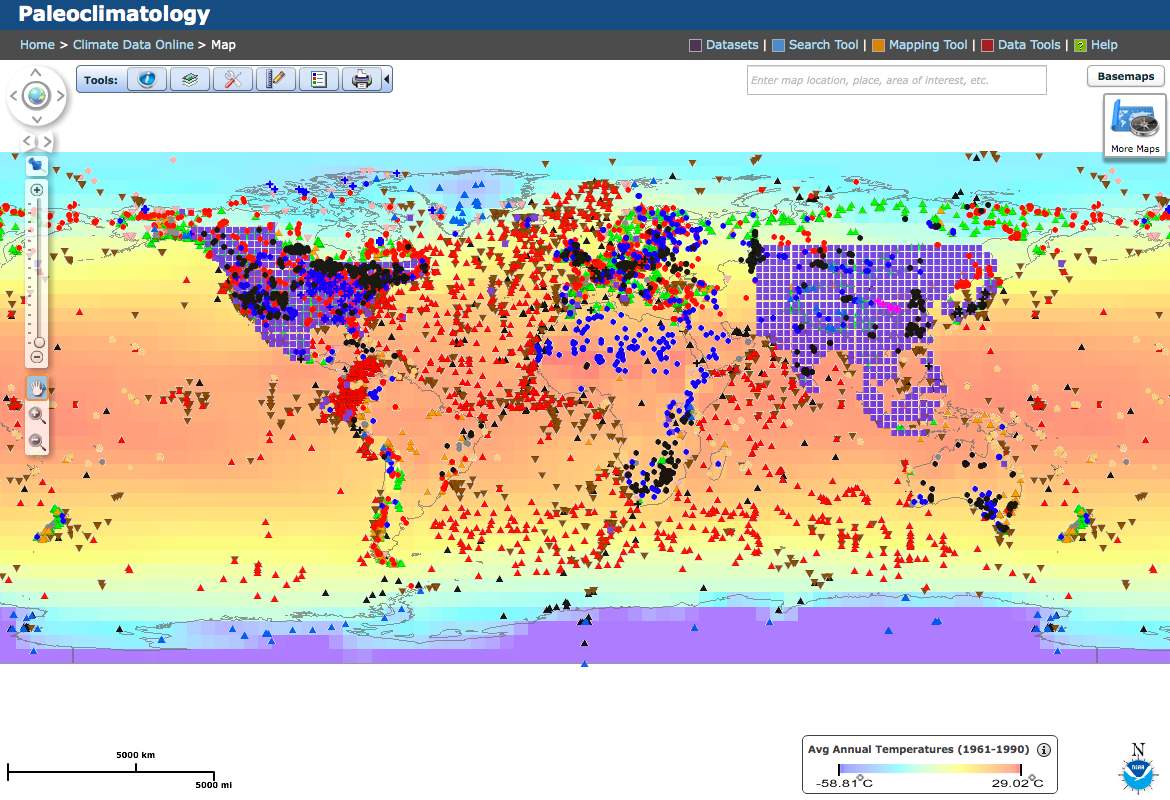
How did past climate vary, and how do we know?
Paleoclimate and pollen proxies

Created and developed by Radika Bhaskar, Stephen Porder
and The Sheridan Center for Teaching & Learning
Acknowledgments

USGS: Gulf of Mexico Integrated Science / public domain

We are in the midst of rapid, human-caused, global climate change.

But how rapid? To test the claim that climate change in the modern era is occurring at unprecedented rates, we need records of climate changes over the past hundreds to thousands of years that show the rates of past climate change. Paleoclimatology is the study of past climates.

Consider the graph on the right. It shows how temperature over the past 10,000 years (the era known as the Holocene) compares to the average temperature between 1961 and 1990. We will return to this graph later.

Globally stacked temperature anomalies for the 5° × 5° area-weighted mean calculation (purple line) with its 1σ uncertainty (blue band) and Mann et al.'s global CRU-EIV composite mean temperature (dark gray line) with their uncertainty (light gray band)

Reconstruction of northern hemisphere temperature anomalies.

Marcott et al., “A Reconstruction of Regional and Global Temperatures for the Past 11,300 years.” Science (8 March 2013).

How do we know what climate was like in the past?

Today we can use instruments like thermometers and rain gauges to record climate variables, including air temperature and precipitation. But how do we know what climate was like before these instruments were invented or in use?

To determine the temperature in the past, we use proxies—things that we think record temperature. For example, if you were to find sediments left by glaciers in Rhode Island, you might infer that the temperature in Rhode Island was colder at the times those materials were deposited than it is today, since glaciers do not cover Rhode Island today.

Many different types of fossil and geochemical data exist that provide records of many different types of proxies. For example, the National Climatic Data Center maintains a collection of Paleoclimatology Datasets that include data derived from many of these proxies.

More about proxies
Screenshot of NCDC paleoclimatology datasets page

Thought question

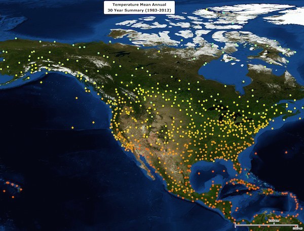
Even in today’s highly instrumented world, thermometers aren't everywhere. How many thermometers do you think we need to accurately assess Earth’s average temperature? Where are most thermometers? Might their locations bias our measurements?

Today we are going to explore one proxy in a bit more detail. We will focus on fossil pollen, and what it can tell us about Earth’s climate history.

Upon completion of this module you should understand:

  • How we use vegetation distributions to infer something about the climate.
  • How we use fossil pollen data to infer past vegetation distributions.
  • How we use pollen data to infer paleoclimate.
 
Continue
 

What is pollen?

When you think of pollen what first comes to mind might be allergies. Maybe you have heard of pollen records. But what exactly is pollen?

Pollen is a powder produced by the anthers in flowers and its individual components are pollen grains whose resistant outer covering protects the male gamete (sperm) of seed plants. Most pollen grains are microscopic (20 - 80 µm) in size.

Composite image of several pollen grains photographed using a scanning electron microscope

Composite image of pollen grains

This composite image shows a pollen grains from several different species photographed using a scanning electron microscope.

Martin Oeggerli/National Geographic

Pollen is not all the same!

Different species of plants produce differently shaped pollen grains. If we examine pollen grains under a microscope we see enormous diversity in shape and size. Why do you suppose that is?

Take a look at the images of pollen grains you see on this page and here. Imagine you were trying to find ways to differentiate different species. How would you differentiate these grains?

We can often identify pollen by its shape and structure, and the presence, absence, and number of features such as spines and holes.

Pollination

When pollen grains land on the female part of the plant fertilization can occur. But how does pollen move?

Grains are dispersed by wind or by pollinators, most commonly insects such as bees. Wind pollination is common: all conifers and many deciduous trees (oaks, elms) are wind pollinated. So too are grasses and herbs (e.g. ragweed).

Inefficiency

But wind pollination is also inefficient: millions of grains are produced for every one that successfully fertilizes a flower. What happens to the remaining pollen?

The inefficiency of wind-pollination leads to millions of grains being blown or washed into water bodies, and we can collect samples of the modern pollen from the surface layers of lake sediments.

Thought question

Why might plants over-produce pollen?

What does this tell us?

The spatial distribution of pollen might tell us about the geographic distribution of the tree species that produced it. How can we evaluate this?

One way to assess this is to compare pollen data and tree inventories.

pollen from hazel male flowers / gilles san martin / CC BY-SA 2.0

These maps illustrate the correspondence between tree distribution and pollen distribution for oak in the eastern half of the United States.

The map on the left shows the distribution of oak trees; the map on the right shows the distribution of oak pollen. As you can see from the map legend, darker colors represent areas of higher concentration and lighter colors represent areas of lower concentration.

Oak Tree Percentages

Oak tree distribution in the eastern United States

Oak Pollen Percentages

Oak pollen distribution in the eastern United States

Legend

< 10%
10-20%
20-40%
40-60%
60-80%
> 80%

Does scale matter?

Does the scale at which you view the correspondence between tree and pollen distribution matter?

Click the button below to view maps comparing tree and pollen distribution at state and local levels.

See other scales

Maps drawn from data in Webb, T., III 2013. Paleoecology. In S. Levine (ed.) Encyclopedia of Biodiversity, Vol. 5. Academic Press, New York: 645-655.

What do these maps tell us?

Look carefully at these two maps and then select the best answer from those listed below.

Continue

Why is it important that these two distributions match?

We want to use pollen records from the past to tell us about where species used to live, so we need to validate that pollen is in fact a good indicator. We can think of pollen data as a form of remote sensing: it allows us to infer vegetation composition across a landscape even when we can't make direct observations.

Species distribution in geographic and climate space

Let us examine the relationship between where species live in geographical space (a species distribution) and climate.

Species differ in their ability to tolerate and thrive under different environmental conditions. For example species may differ in tolerance to dry conditions, or cold conditions, because of differences in their physiology. Where species live can reflect these tolerances.

In this section we'll be examining where species are found spatially, their distribution, in order to quantify their temperature and precipitation requirements.

As an example, think about palm trees – where do they live? You almost never see them growing in areas that receive snow...

Palm trees in snow, Jerusalem

...which tells us about their temperature tolerance.

How can we examine where a species is found spatially?

To begin answering that question, let us first look at the spatial variation in temperature and precipitation. We can explore these data using tools from the National Climate Data Center (NCDC), which has compiled global climate station data.

Open the NCDC's Global Climate Station Summaries page by clicking the button below.

Open Global Climate Station Summaries

Before you continue, take some time to explore! For example, check out your home town. How does it compare to other regions nearby? How do the 5, 10, and 20 year annual temperature averages compare?

Note

The Global Climate Station Summaries page displays a large amount of data. It may take some time to load initially and when changing the data shown on the map. Be patient!

If the site opens to an overview page, select the All Maps tab, then choose Global Climate Station Summaries.

What strikes you when you look at the Global Climate Station Summaries map? What questions come to mind? Why do you think some areas have fewer data points than others?

Continue
davis weather station / mingyoung choi / CC BY-SA 2.0

Spatial variations in temperature and precipitation

Let's start by using the Global Climate Station Summaries tool to look at seasonal differences in temperature. Complete each step in the instructions below; when you're ready to move to the next step, click the Next button to continue.

Instructions

1. Update data selection

Follow these directions to update the data displayed on the map.

  1. For the Category option, select Temperature
  2. For Type, choose Mean July
  3. For Summary, select 30 Year
Screenshot of options available for selecting data to view

When you have made these selections, click the Update button to view the results on the map.

2. Zoom to North America

Next, move the map and zoom in to focus on North America so you are viewing something similar to the image below.

Screenshot of North America with climate data overlaid

You can hide the Explore tab if you want to make more room for the map itself.

3. Examine temperatures

In the Explore tab, the legend displays what temperatures the colored points on the map correspond to, in degrees Celsius.

Screenshot of the legend for NCDC Global Climate Station Summaries tool

For example, an average temperature that is a dark yellow corresponds to a temperature between 15-20°C (59-68° Fahrenheit).

What does each point on the map represent?

These data are collected hourly, so when we are looking at the 30 year summary of mean July temperatures each point is the average of all 24 hours of the day, for each day of the month of July, for 30 years of July data, for that location.

We can update the map to display different types of temperature data as well. For example, we can choose to view Mean January temperatures instead; update the map now, following instructions above, to display mean January temperatures.

What differences do you observe between the mean January and mean July temperature maps?

Continue

Precipitation

Keeping the Global Climate Station Summaries temperature map open in another browser window, now look at the map of annual precipitation in North America on the right.

Instead of displaying individual climate stations, this map shows larger areas shaded based on the amount of precipitation they receive annually.

Comparing January temperatures, July temperatures, and annual precipitation

Let’s compare the temperature maps for January and July and the annual precipitation map.

1. When looking at these three maps together, what broad trends do you observe?

Select all the statements that are true.

2. In which time period is the magnitude of the temperature gradient the highest?

Continue

Geographic distribution

Next, let's look at where different tree species are found geographically. These data were compiled from pollen samples collected in the surface sediments of lakes and bogs across North America, then assembled into a database.

Let's examine distribution of spruce (the Latin name for the genus is Picea) on a map generated from this collection of pollen data. The areas where spruce are found today are shown in green on the map below, with the higher abundance areas shown by darker areas.

Why don't we just look at where the trees themselves are found, instead of relying on pollen proxies?

We are using pollen data rather than tree inventories because this is the same method, with the same biases, we'll subsequently use to examine fossil records.

Distribution of spruce

Based on the map, what is true about the distribution of spruce?

Map showing modern distribution of spruce (Picea) in North America
Continue

Climate space

Based on its distribution, and the previous maps of temperature and precipitation, we can plot where spruce is found on a different kind of graph, to show where it occurs in climate space rather than geographical space. Climate space is a conceptual space, defined by environmental variables that influence where species live.

Look again at the maps showing mean annual precipitation and mean January temperature, and compare them to the map showing the distribution of spruce. Imagine focusing on those regions where spruce is found at the highest density today, represented by the areas shaded in the darkest green.

Now, in the graphic on the right, drag the circle to the position that best approximates the temperature and precipitation combination where high-density spruce is distributed.

I'm confused. Help!
Approximate high-density spruce distribution

Tip

When using the Global Climate Station Summaries tool, you can use the Polygon tool (found in the Selection tab) to draw a region directly on the map. This may help you identify the area that corresponds to what the distribution maps depict in the darkest green color.

What are we trying to do here?

We are superimposing the spatial distribution map onto the environmental/climatic variation maps—the maps showing temperature and precipitation—in order to plot where a species lives in climate space.

Illustration of the concept of layered maps (temperature, preciptionation, and distribution) leading to a representation of climate space.

Let's make sure we understand what the climate space graph represents, and how it does so. To understand the climate space graphic, we should start by looking at its basic components.

Next

The graph shows temperature on the y axis...

Next

...and precipitation on the x axis.

Next

What happens as we move from left to right on the x axis? Does this represent wetter or drier conditions?

Which area represents the combination of warm and wet conditions? Drag the circle to the correct region.

Continue

Now that we understand the climate space, let’s go back to the map that shows where spruce is most abundant, the darkest green spots.

Map showing modern distribution of spruce (Picea) in North America

If we superimpose areas of high spruce occurrence onto the map of January temperatures, it is clear that spruce is found in the areas which correspond to cold temperatures (represented by dots shaded blue).

So if we revisit the ‘climate space’ graph of spruce from a moment ago, we can see that the correct region, corresponding to the highest abundance, is the one highlighted here.

Response surface

This environmental space that the species occupies is a conceptual space useful for understanding climate tolerances, and also for predicting future responses to climate change. In the study of past vegetation and climate, it is important to quantify this climate response surface.

Species differ in their distribution, reflecting differences in their response surfaces. We'll look at oak as an initial case study that illustrates this.

Oak

This is a map of the present distribution of oak in North America.

Map of present oak distribution in North America

As you look at it, think about the areas of highest oak concentration in relation to the temperature and precipitation maps—the same maps you used in the spruce exercise above. Focus on those areas that correspond with the highest abundance locations for oak.

In the graph to the right, select the region that best approximates a response surface for oak, representing its climate space for mean January temperatures and precipitation.

Don't want to scroll back to look at the maps? Click the button below to open them in a handy sidebar.

View Maps
Oak
Continue

How do we know where species lived in the past?

We can define response surfaces based on current distribution, because we can go to the forest, conduct an inventory, and record our observation on where species are found.

But how do we know where species lived in the past? Species have not always been where they are now. One clue about the past distribution of species comes from fossils, such as fossils of pollen.

We can use look at pollen records from the past as well.

Discussion

We have evidence that species move in geographic space over geological time. Why is this important? If we are using a species' presence as an indicator of a climate, we are assuming that the species has not evolved or changed its climate preference over time. Is this a fair assumption?

Spruce

Animation of North American spruce distribution from 21,000 years ago to the present

This animation shows changes in the distribution of spruce during the period from 21,000 years ago to the present. Regions shaded in blue represent the ice sheet that covered much of North American during the last ice age.

As you view the animation, observe what happens with the distribution of spruce and the ice sheet over time.

How do trees migrate?
How would you characterize the shifts in spruce distribution?
Continue

What we have covered so far:

  • Pollen varies among species in size, structure, and morphology.
  • Because pollen corresponds to where tree species live, we can use pollen as evidence for species distribution mapping.
  • Species differ in their distribution, reflecting among other things differences in tolerance to climate variables such as temperature and precipitation.
  • We can quantify these differences by plotting species response surfaces, to represent the range of different variables a given species occupies.
  • Species change their distributions through time.

Lab exercise

Sediment core analysis

Let’s now explore in depth how analysis of fossil pollen, and therefore species distributions in the past, can give us some insight into climate.

The scenario

You are part of a team that is trying to understand how climate in the northeast United States has changed since the southern edge of the ice sheet was located in southern Canada, approximately 11,000 years before the present (BP). You are going to use fossil pollen data as your climate proxy.

How does pollen become fossilized in the first place?

As pollen is dispersed from trees it sometimes falls into water bodies, settles, and over time ends up in the sediment. Pollen grains have outer walls made of sporopollenin—a complex organic molecule that does not decompose when buried in sediment and thus is preserved through time.

Image of sediment cores

Sediment cores

Sediment cores, taken with a gravity corer at the Greenland continental slope
Hannes Grobe / CC BY 3.0

As you can see in the image of the sediment core (left), there are different layers that have formed over time. The deeper we go in the core, the older the layers.

Take a look at the layers formed over time. Do they remind you of other biological or physical patterns you have seen?

We can collect soil from each layer and age or date it using radiocarbon dating, which analyzes the organic matter (the carbon) found in each layer. For more information on radiocarbon dating, take a look at this page.

Procedure

1. Collecting the sediment cores

You and your research team travel to a nearby water body and collect sediment cores.

2. Preparing samples

After returning to the lab, you have to spend time preparing the samples.

You first divide the core into many different depth sections. You are asked to prepare the section at a depth 150 cm for analysis; the other depth sections are distributed among your team.

3. Isolating the pollen

You know you need to isolate the pollen, but how will you remove them from the mud mix they are in?

It turns out you have to use hydrofluoric acid and sulfuric acid to dissolve away the sand and organic matter, leaving behind the pollen grains—a dangerous process! This step alone takes an entire day.

4. Examining the sample

Finally, you are ready to examine your sample under the microscope. You take the concentrate that remains after the acid treatment and prepare a slide.

In your slide, taken from a depth of 150 cm in the sediment core, you find five main types of pollen.

You now must identify each of the main pollen types by name and calculate the relative abundance of each species.

Before you can identify the grains of pollen you have found, you'll need to know a little about common features of pollen grains. Here are two of the features that will assist you:

Bladder (air sac)

Pollen grain with two bladders (air sacs) indicated by gray arrows

How air sacs are attached to the body of the pollen grain—whether they are fused to the body or more constricted at the point of attachment—is an important identification characteristic.

Pore

Malvaceae pollen with three large pores indicated by orange arrows

A pore is a small hole on the surface of the grain. Some species of pollen always have a specific number of pores, while others are more variable.

Why might pollen have air sacs?

Hint: think about how pollen can be dispersed.

Instructions

The space below contains microscope images of each of the five main types of pollen you have found in your sample. Your sample contains 1201 total grains of pollen (410 from the types shown below, plus an additional 791 grains of other types).

When identifying pollen, you'll often use a pollen key. Keys used for classification generally include questions in the form of paired statements about the features of each pollen grain; depending on what you observe, your answer to the question will direct you to the next step, and you'll proceed in this manner until you have arrived at the correct identification.

To simplify the presentation of the key for the purpose of this exercise, you'll see only one question at a time about the features of each pollen grain. Based on your answers to these questions, the key will indicate the correct type for each pollen grain. If you're interested in seeing what an actual key might look like, click the button below.

View a sample key

Once you've identified the pollen, you'll need to calculate its relative abundance within the sample by dividing the number of grains of that type by the total number of grains in the sample: # of type / total grains x 100. Round the percentage to one decimal place.

Click the Identify button for any of the pollen grains shown below when you're ready to begin.

2 grains
Pollen A

Click the button below to view the key and identify this type of pollen.

Plot
Identify
359 grains
Pollen B

Click the button below to view the key and identify this type of pollen.

Plot
Identify
3 grains
Pollen C

Click the button below to view the key and identify this type of pollen.

Plot
Identify
31 grains
Pollen D

Click the button below to view the key and identify this type of pollen.

Plot
Identify
15 grains
Pollen E

Click the button below to view the key and identify this type of pollen.

Plot
Identify

Does the pollen have a bladder?

Yes
No

Is the connection between bladder and body constricted?

Yes
No

Is the pollen spherical/round or elongated?

Spherical
Elongated

Does the pollen have spines?

Yes
No

Does the pollen have pores?

Yes
No

Does the pollen have three pores or four pores?

Three
Four
You've identified this pollen as .

Unfortunately, that is incorrect.

Try again

What do the data tell us?

The depth of 150cm corresponds to 5,300 years in the past. So imagine we are getting a glimpse of what lived in this area thousands of years ago! All five of these species were present at that time. But as you can see, their pollen was not equally abundant.

You calculated that hemlock had the highest abundance: the almost 30% relative abundance you calculated lets us estimate that roughly one third of the trees at this site were hemlock. There were very few spruce and pine trees.

You now must assemble the data from everyone else on the team, who have been working on the remaining slices of the core. Once you do so, you'll have graphs that depict how the abundance of different species changed over time in this one location.

Show all data
Depth = Age

Depth in the sediment core can be displayed as age. In fact, we can easily update the graphs to show the age of our samples.

Show age

Patterns in the data

Now it's time to begin interpreting the data your team has collected. To start, let's try to to identify patterns in the periods of highest abundance. Which species peaks in abundance earliest (at the oldest time in the past)? Drag that graph to the bottom of the sequence, then continue to reorder the individual pollen graphs so that they are in chronological order by peak abundance.

Click and drag any pollen diagram to move it up or down in the sequence.

The data you have been examining are actual data!

The sediment core was collected from North Pond, located in western Massachusetts. Based on analyzing the pollen as you have just done, and by comparing with other proxies, the authors of this study inferred what climate was like in the past.

As you can see, the image on the right—from the published study—closely resembles the pollen diagrams you have been working with.

Shuman et al. North Pond pollen graphs

Shuman, B., P. Newby, Y. Huang, and T. Webb III. 2004. “Evidence for the close climate control of New England vegetation history.” Ecology 85:1297–1310.

Let's make an estimate of what air temperature might have been at different points in the past.

To do so, we'll once again be using the Global Climate Station Summaries page—so make sure you have it open in another browser window before continuing.

Instructions

1. Look at modern spruce distribution

This map shows the present distribution of spruce in North America. Look closely at the regions of highest spruce abundance.

Map of North American distribution of spruce in the present

2. View climate station data

Now, on the Global Climate Station Summaries page, change Type to Mean Annual and Summary to 5 Year, then update the map.

Look at the climate stations within the region where spruce is most abundant. Using the Identify tool (found in the Selection tab), click on an individual station.

In the results window, select the checkbox next to the name of that station, click Get Selected Data, choose the Simplified data option, then click Access Data.

3. Calculate multi-station average

You'll see a display of the 5 year average temperature for each hour of the day, during each month of the year, for that station. The column on the far right contains the annual average; go to the bottom of the page and record the annual average temperature listed in the top row of the bottom right cell (identified as the mean).

Repeat this process for two more stations in the region, recording the annual average temperature for each.

Next

4. Add the average temperature to the graph for spruce

At this point you should have three temperatures, one from each of the three stations you've looked at. Calculate the average of these three. If you are not able to access data from three different stations try changing the average to a 20 year average or select just one station.

Now, in the chart for spruce below, enter the average temperature you calculated for the three climate stations into the field labeled Avg. temp.

What do these graphs mean?

The pollen graph on the left should be familiar to you by now: it shows the percentage of spruce pollen in each sample from the sediment core we have been working with. By calculating the average annual temperature in the region where spruce is most abundant today (the number you entered a moment ago), we can estimate the temperature during the periods of highest spruce abundance in the past.

The chart on the right is a representation of this estimate, drawn in relation to the depths of the sediment core where spruce pollen is found in the highest concentrations. In our sediment core, spruce peaks at depths of roughly 375-480 cm. Based on what we know about the current distribution of spruce, we can estimate that the temperatures during the time period corresponding to the depth of these core samples were similar to the mean annual temperature you calculated by looking at climate station data.

Let's continue by following the same procedure for pine.

Map of North American distribution of pine in the present
Continue

We’re now adding data from species that have abundant pollen at depths that correspond to roughly 11,000-8000 years before present (pine). What do you observe? It's clear from these charts that temperatures are warming rapidly (although note this occurs over thousands of years).

Let's finish by add temperature reconstructions for chestnut, following the same method you've used for the previous species.

Map of North American distribution of chestnut in the present
Continue
Continue

We find that temperatures continue to warm up to a point around 2000-3000 years ago.

This trend is easier to see if we merge all of the temperature reconstructions into a single chart. Let's do that now.

Merge

But that is what we observe in this one given locality. How can we estimate across larger spatial scales? In order to do so, we need to add data from more pollen cores that give us information about a larger area.

Animated map of spruce distribution between 5000 years ago and the near present

Let's take another look at changes in spruce distribution that have occurred between from 5000 years ago to the near present. This animation shows records from many different cores, telling us how the abundance of spruce pollen has changed across both different depths and different localities—in other words across both space and time.

Instead of focusing on the areas of highest abundance, the darkest green, in this case follow the southern-most edge of green in the area that corresponds to New England and the northeaster United States. How does this change over time? What do you observe in the window from 5,000 – 500 years BP?

How has the southern limit of spruce distribution changed in the past 5,000 years?

1. How has the southern limit of spruce distribution changed in the past 5,000 years?

2. What would you infer from the movement of spruce?

Continue
Pollen can be a proxy of paleoclimate, but it is not the same as taking a measurement with a thermometer.

As we have seen, species live over a spatial range that includes temperature variation, so the presence of a particular species does not pinpoint an exact temperature.

This means that the temperature values we calculated for a particular species actually cover a range of values.

In addition, temperature and precipitation are not the only factors that determine where species are found. What other factors can you imagine might influence where trees live?

Factors including soil and biotic interactions, as well as how pollen is dispersed, also influence distributions. These can add further complexity in interpreting fossil pollen data in a climate context.

Temperature reconstructon chart illustrating the fact that temperature ranges for a particular species are estimates, and consequently have a degree of error associated with them.

So how reliable is pollen as a proxy of past climate?

Ultimately it provides an estimate that has uncertainty associated with it. For this reason we do not rely on it, or any single proxy, alone to understand climatic variation in the past.

Instead, we compile various independent proxies that cover different temporal scales, as well as integrating information from different geographic areas.

If you return to National Climate Data Center site and view the Paleoclimatology section, you can view where records have been collected for different climate proxies.

Screenshot of NCDC Paleoclimatology map

We use the average of multiple proxies to reconstruct paleoclimate. When these independent pieces of evidence correspond, that is provide a similar pattern over time, we have more confidence in our interpretation of climate in the past.

The graph we saw earlier is an average drawn from 73 different records, including 4 fossil pollen records. Our understanding of past climate is drawn from a synthesis of many lines of evidence.

Looking more closely at this graph, what does it tell us about modern climate change? Early in the Holocene, after the last ice age, warming occurred over thousands of years. Subsequently, temperatures were relatively stable with a gradual cooling until about 200 years ago. The sudden spike in temperatures shown by the vertical line to the very right of the graph is modern warming, a result of human industrial activities. It stands in contrast in rate and likely magnitude: temperatures are rising so quickly they will soon reach levels not experienced for the last 10,000+ years.

For more information on this study, you can read this article, or read a Q & A with the authors, which includes more detail on their work.

Globally stacked temperature anomalies for the 5° × 5° area-weighted mean calculation (purple line) with its 1σ uncertainty (blue band) and Mann et al.'s global CRU-EIV composite mean temperature (dark gray line) with their uncertainty (light gray band)

Reconstruction of northern hemisphere temperature anomalies.

Marcott et al., “A Reconstruction of Regional and Global Temperatures for the Past 11,300 years.” Science (8 March 2013).


Congratulations!

You should now have a solid understanding of how we use pollen as a proxy for paleoclimate reconstruction.

Please go to the course page on Canvas and complete the assignment associated with this module.


It looks like this is your first visit.

Here are a few tips to help you get started.


Use a modern desktop web browser.

This page requires a recent version of Firefox, Safari, or Internet Explorer to function properly. If possible, update your browser to the latest available version.

Because some exercises require components that are only available on non-mobile platforms, you won't be able to complete the module if you are using a mobile device to view this page.

For best results, make your browser window as large as possible and make sure that cookies are enabled.

Understand the icons.

Certain icons are used consistently throughout this module to prompt certain actions on your part:

 You'll need to answer a question (or short series of questions) before proceeding.

 The module is paused and you must do something before continuing.

 You'll need to open an external page before continuing.

 Additional (and optional) information is available in a sidebar.


Start


Brown University logo

Created and developed by

Radika Bhaskar
Center for Environmental Studies
Brown University

Stephen Porder
Environmental Change Initiative
Brown University

The Sheridan Center for Teaching and Learning
Brown University

Scientific Collaborator

Thompson Webb
Geological Sciences
Brown University